| |
| |
|
|
|
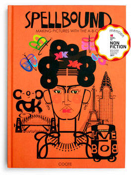
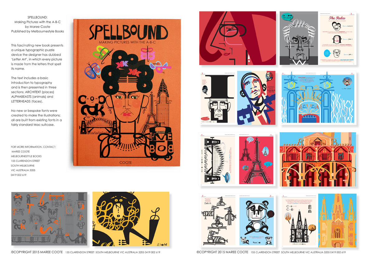
WHAT'S BETTER THAN SPELLING A WORD CORRECTLY? SPELLING A PICTURE BEAUTIFULLY! Spell your way around the world with this ingenious new Melbourne typographic invention! 120pp hardcover ISBN 9789-9924917-27 RRP $39.95  TO READ REVIEWS FROM KIRKUS REVIEWS USA, PUBLISHERS WEEKLY USA, BOOKLIST USA, MAGPIES AUSTRALIA, CBCA JUDGES' REPORT, AND MANY MORE CLICK HERE COVER NOTES: "I've always wanted to be a man of letters. This is very cool indeed." -Tim Minchin, (Matilda) Musician, Actor, Comedian & Writer "My kids can't get enough of these brilliant original illustrations. They can't stop til every last letter is found." - Eddie Perfect, (Playschool) Writer, Composer, Performer "Alphabetic, acrobatic --this is my kind of playground." - David Astle, (Riddledom) Word & Puzzle Guru |
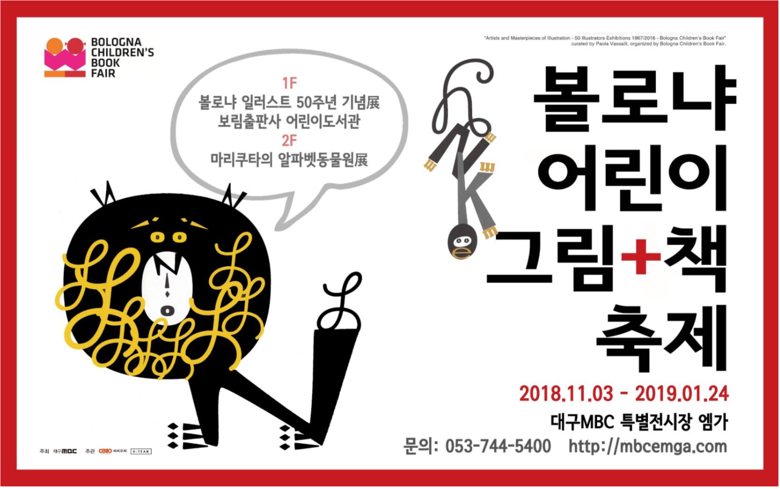
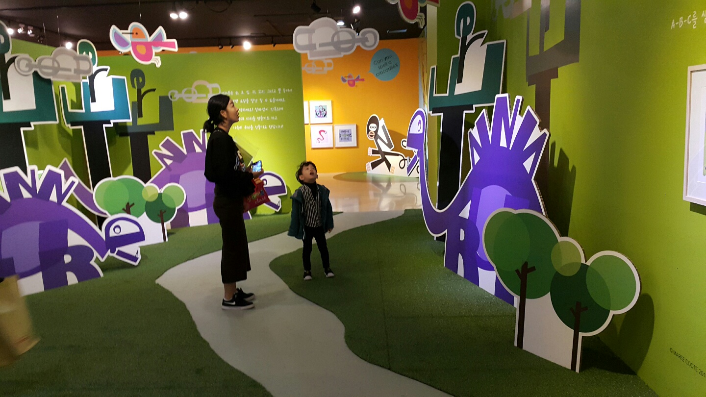
| The Fontigram was developed by Melbourne graphic designer and writer Maree Coote. After creating various photographic alphabets for childrens books and graphic design projects including Alphabet City, Coote further fine-tuned her vision by moving beyond 'found object' letters photgraphed in the environment, to this typographic design device. These remarkably succinct images made from only the letters that spell the subject's name. She calls these works 'Fontigrams' because they are built from existing fonts. None are hand-lettered, none are bespoke fonts. Every font used in the creation of an image is from a standard Mac font suitcase. |
|
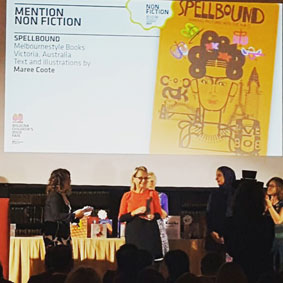
Shortlist FINALIST in CBCA AWARDS 2017 - EVE POWNALL INFORMATION AWARD JUDGES REPORT "What may not look like an information book at first, certainly is one with an instructional wrting-type that aims to increase knowledge and execution of a unique style of letter art -- fontigrams. The presentation in this book is bold and colourful. It is sturdy and the cover is funky and exciting. Perfect for individual readers and groups of readers, this book will provide hours of word fun for a young readership; engaging time in copying and practising examples for middle readers; and plenty of source material for graphic art skills. It is multi-purpose. Nowadays publishers and creators should invent ingenious ways of presenting information that doesn't look as though it comes from an iPad or website or an ebook. This book is a wonderful example of what cam be achived when they put thir soul into it." -- from The CBCA Books of the Year Awards Judges Report 2017. |
|
|
Book launcher David Astle from ABC774 Radio, with his LETTER ART PORTRAIT 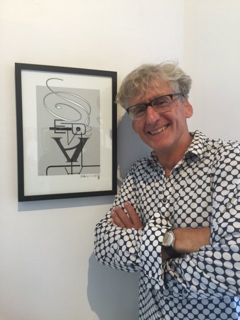 Above: Book launcher David Astle from ABC774 Radio with a portrait by Maree Coote. |